Helping you visually communicate with intentionality through report and visual identity design.
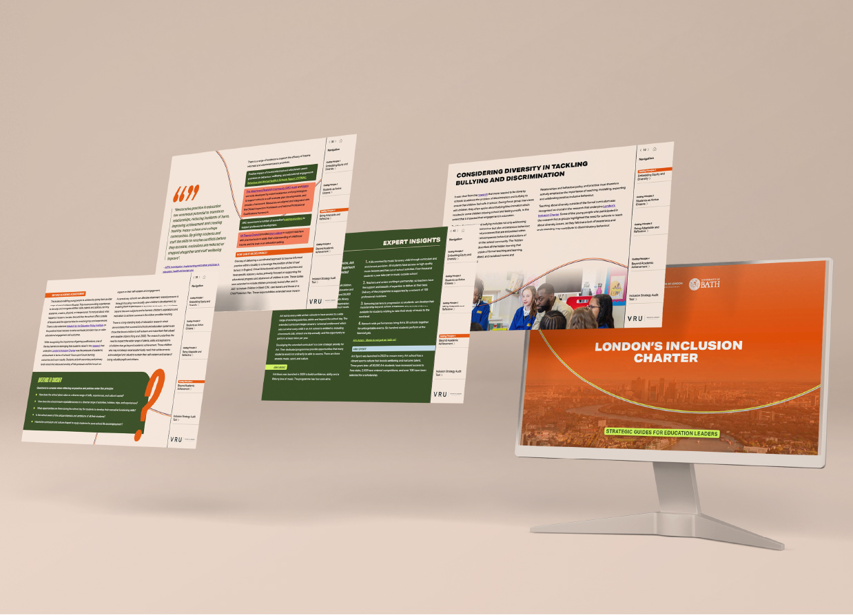
See the workLondon's VRU needed visuals that better resonated with the communities they serve; as well as communicating their work better to their broad range of stakeholders.
This work included a visual brand development and the design of a series of long-form guides and reports.


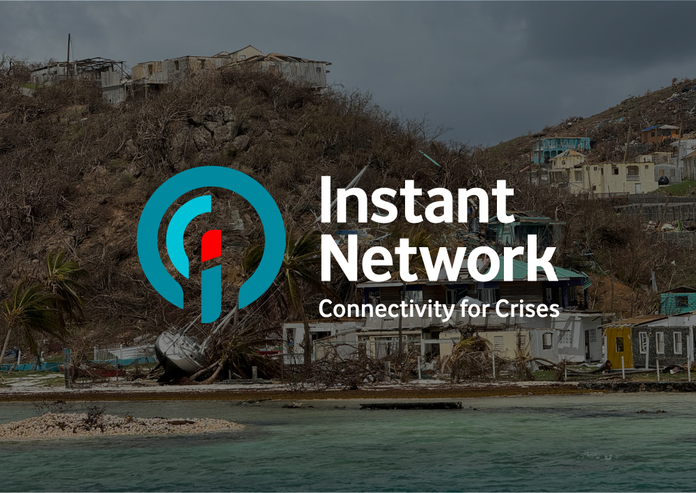
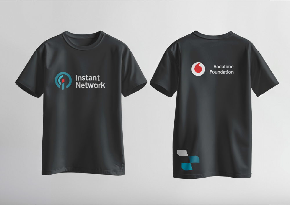
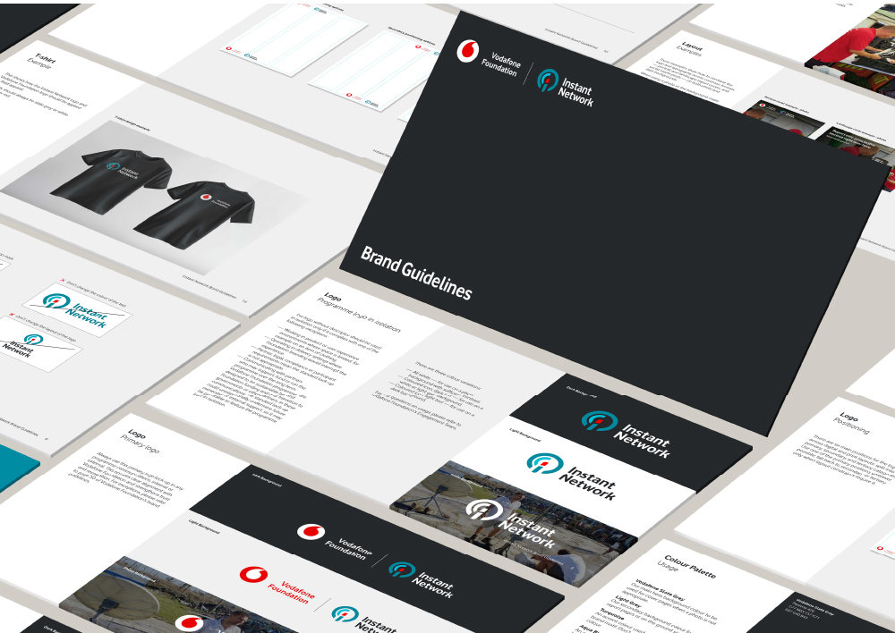
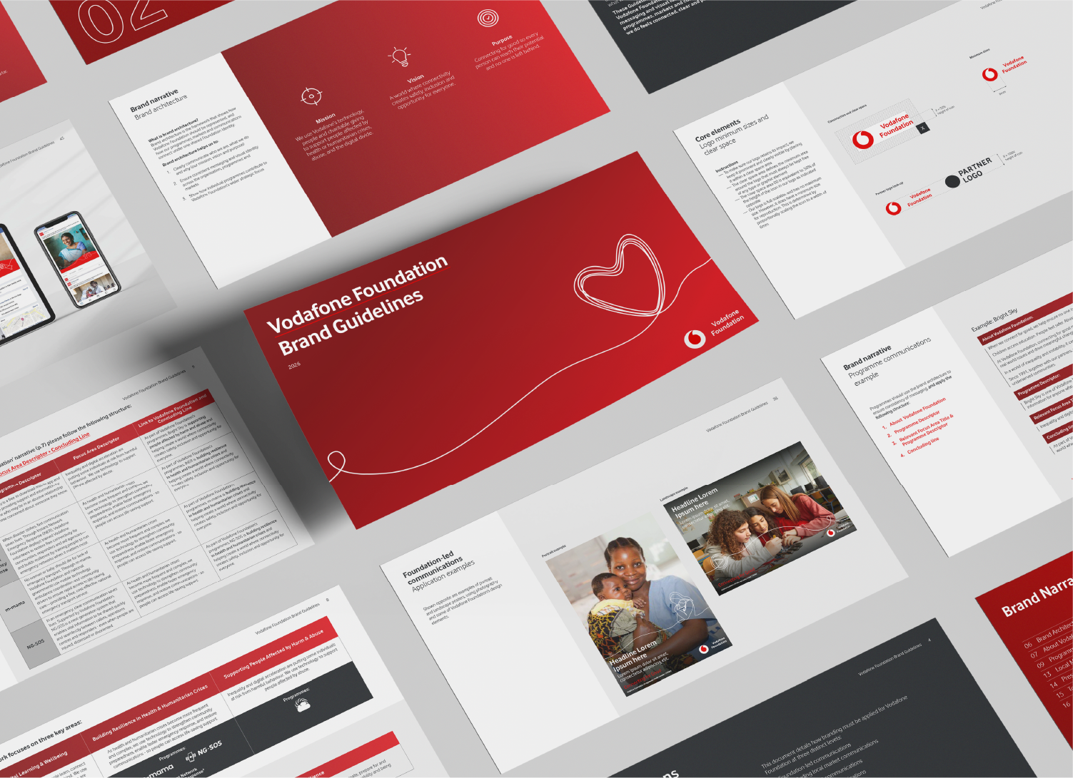
Vodafone Foundation's programme Instant Network has been restoring connectivity after disasters since 2012. However, they were operating without a distinct visual identity. This work saught to address this gap and create a visual identity for the programme that aligned itself strongly with Vodafone Foundation.
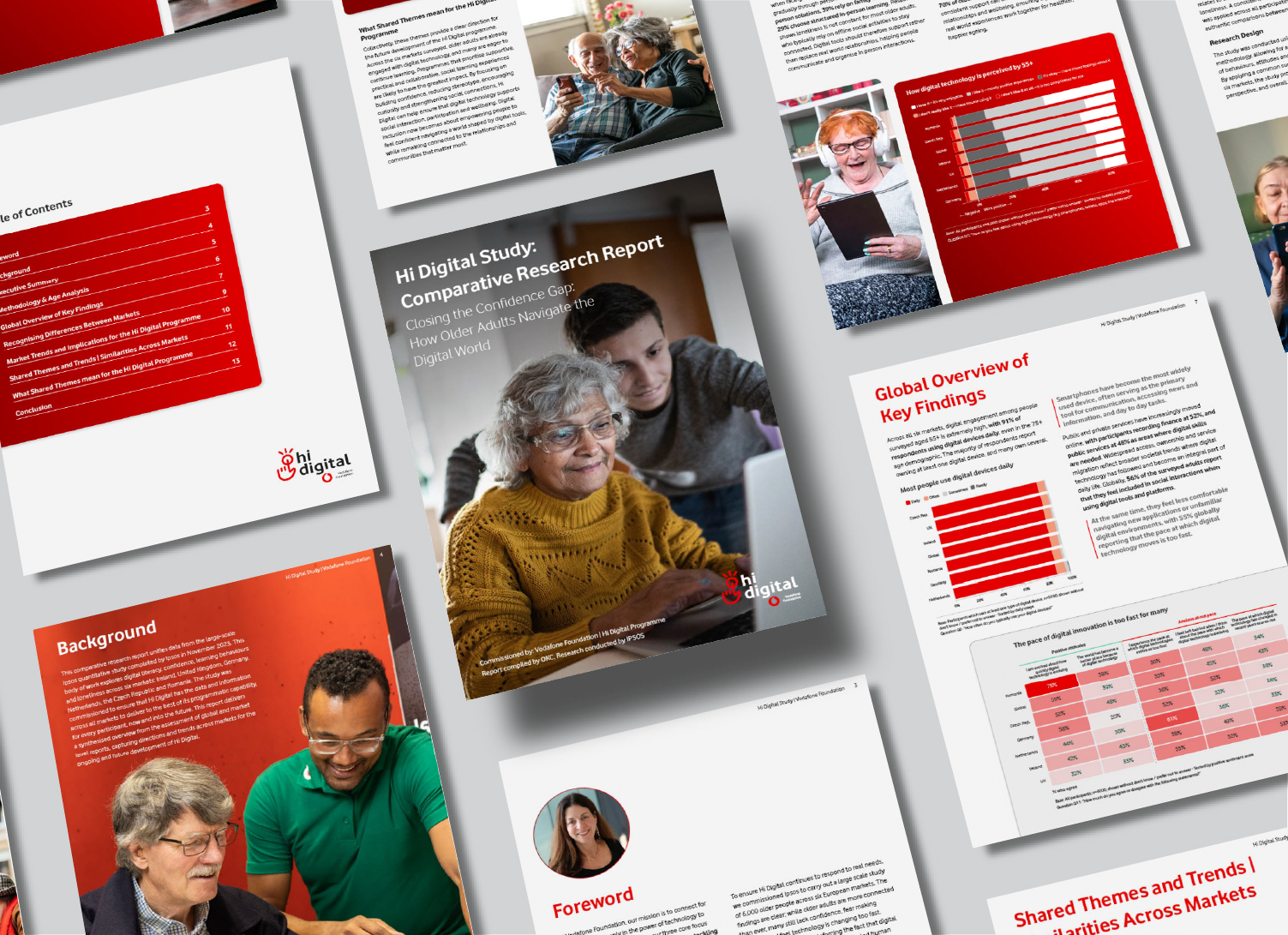
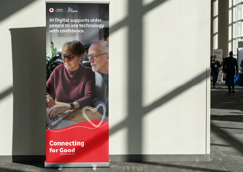
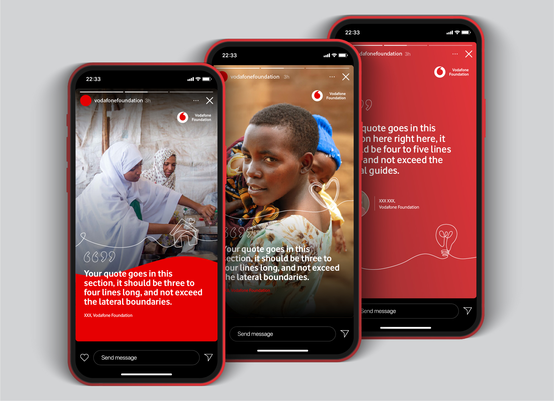
Vodafone Foundation needed a comparative research report designing for their programme brand HiDigital, as well as a visual brand development and a full suite of branded templates.
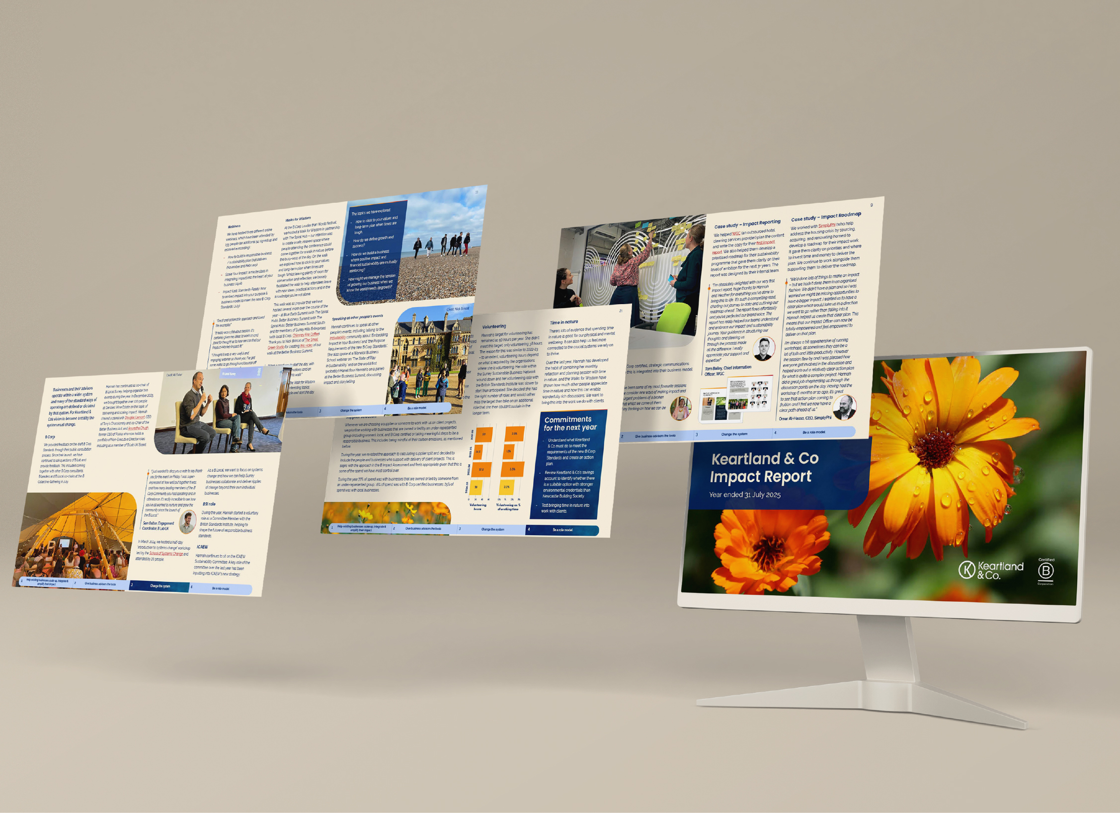
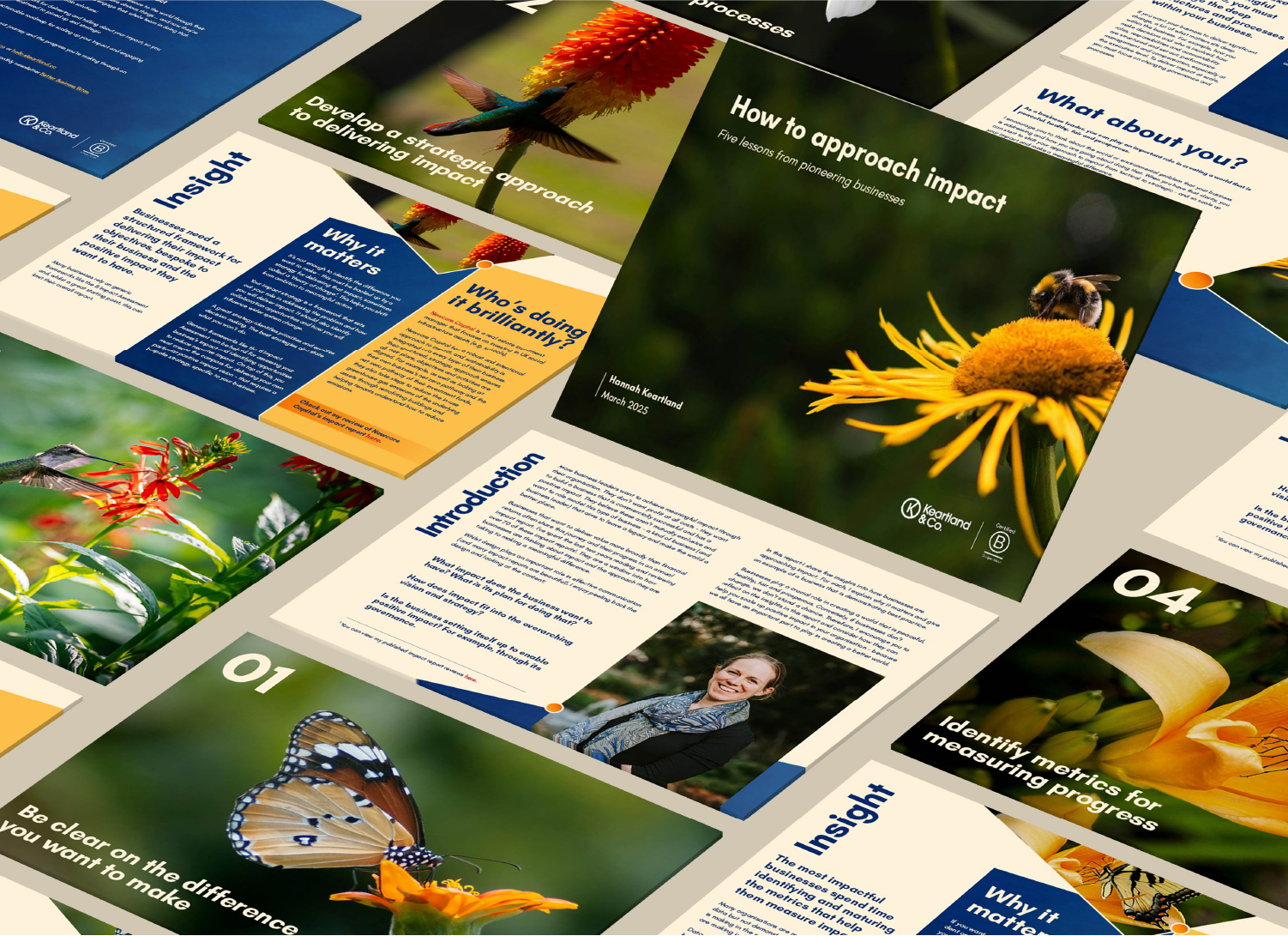
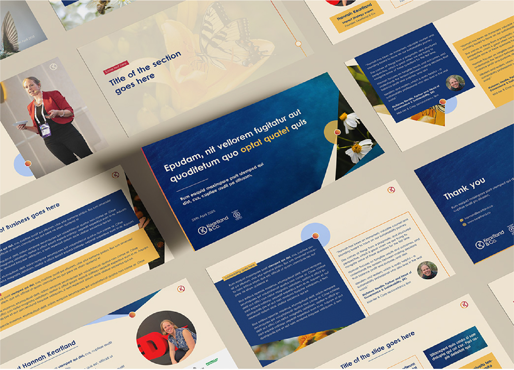
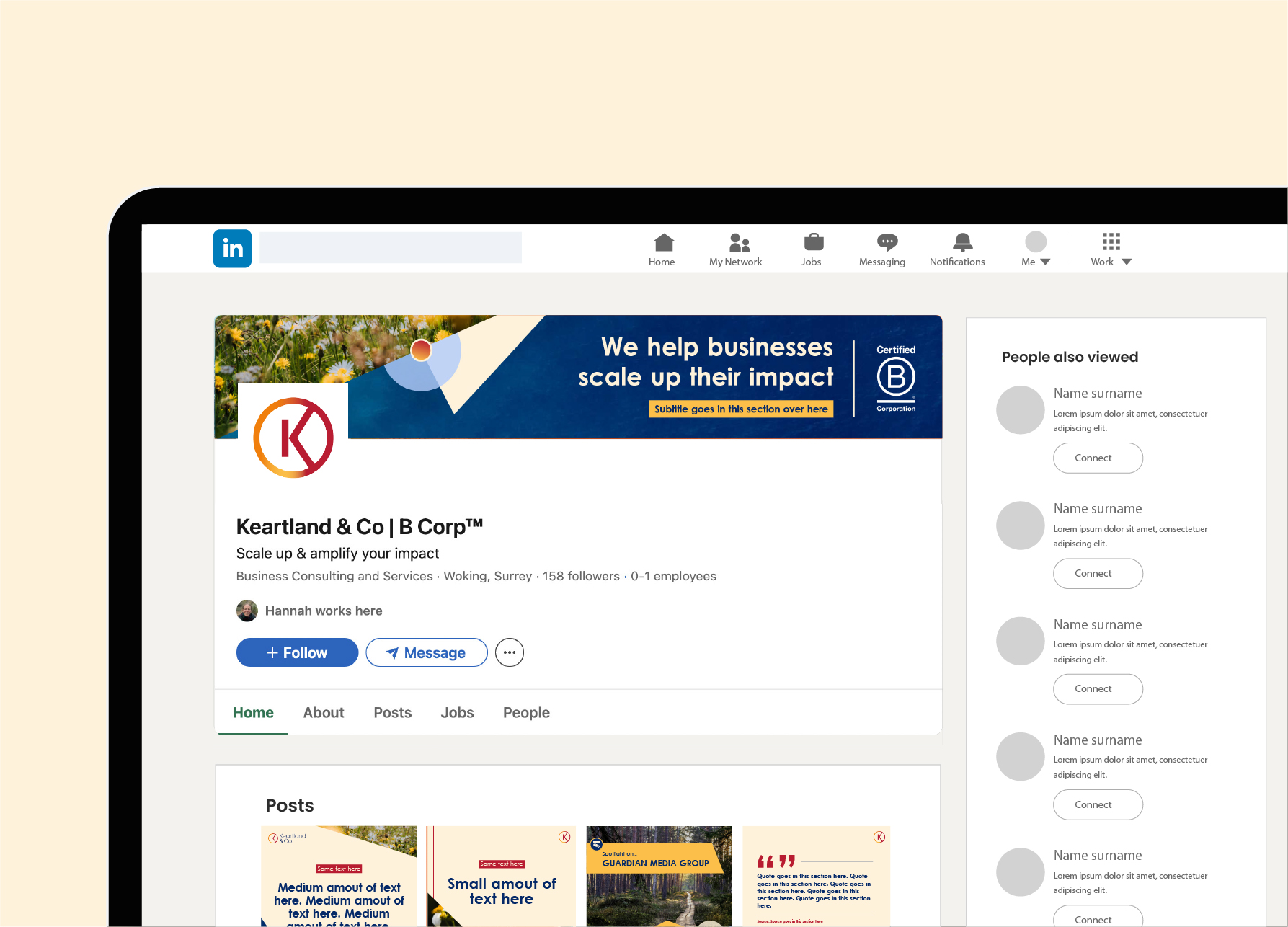
Keartland & Co is an impact consultancy that needed design for their yearly impact reports. Each report was designed with its own visual theme, whilst sitting coherently within their existing brand identity. Additional work included a branded PowerPoint template, social media templates, and a visual brand development.
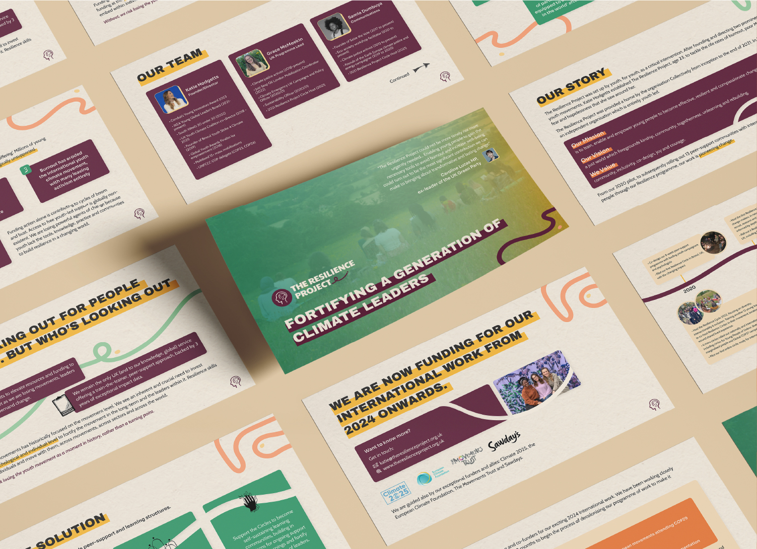
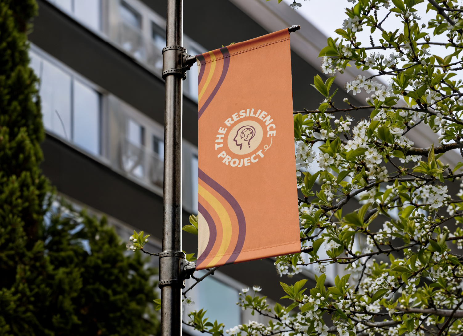
The Resilience Project is a global non-profit that needed a visual identity redesign to resolve the disconnect between their mission and their visuals.
This work also included a pitch deck design, social media designs, and diagram design work.


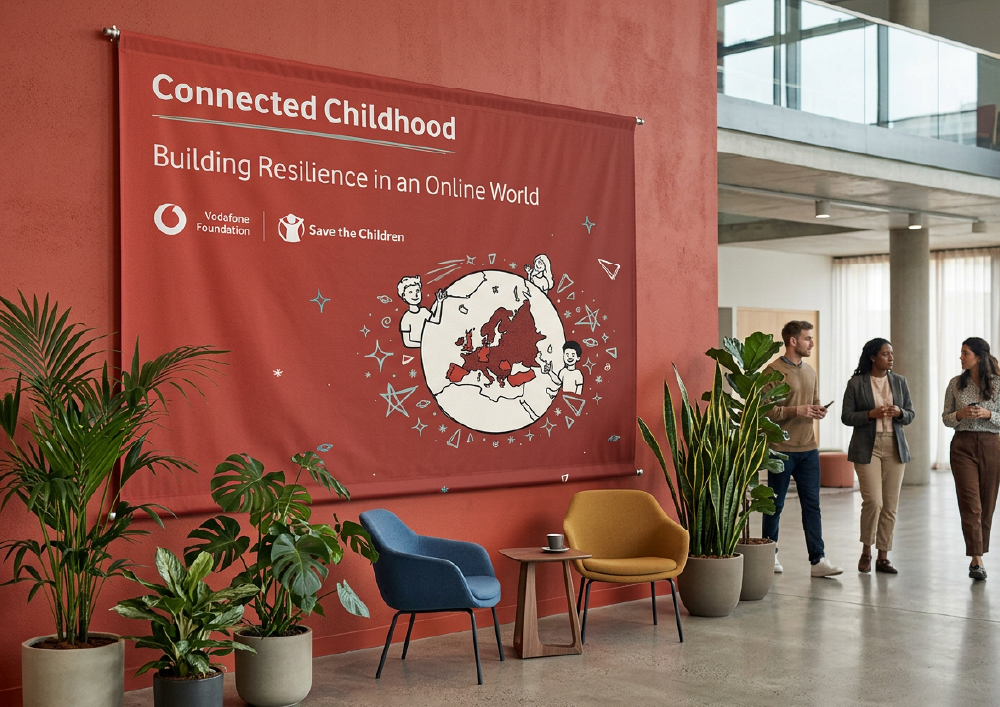
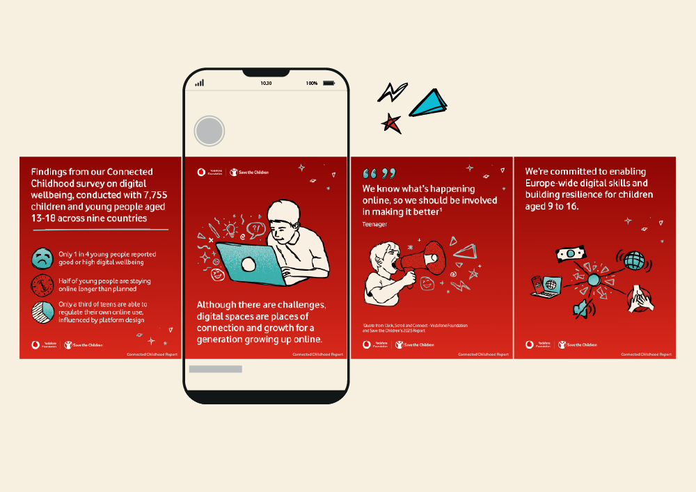
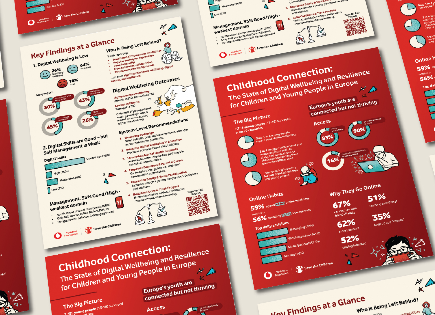
Vodafone Foundation & Save the Children's 'Connected Childhood' event explored digital wellbeing among young people across Europe.
This work involved transforming their existing report's visuals into engaging event and social assets: including a banner, wall design, social templates, carousel, and a two-page summary infographic.

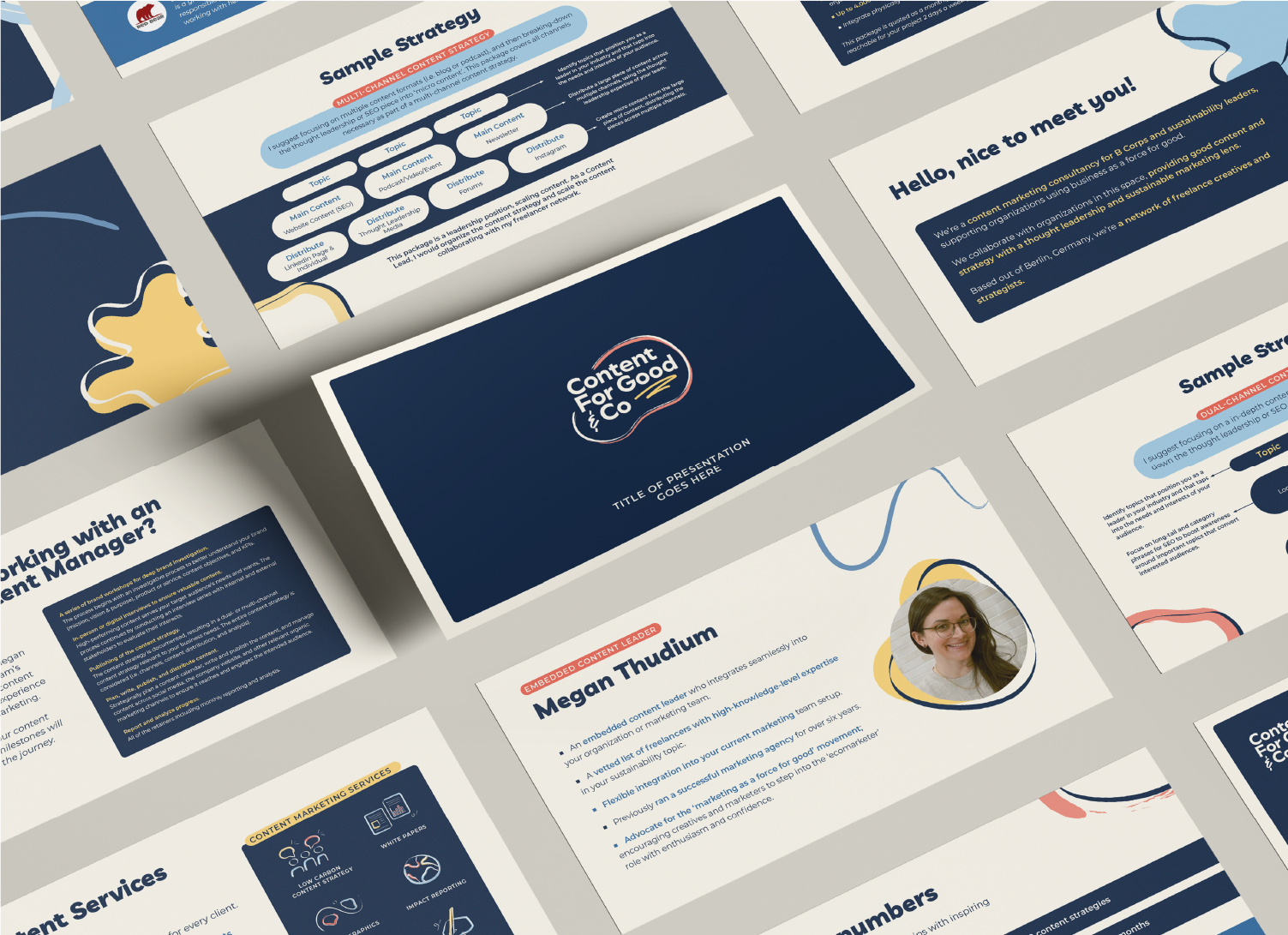
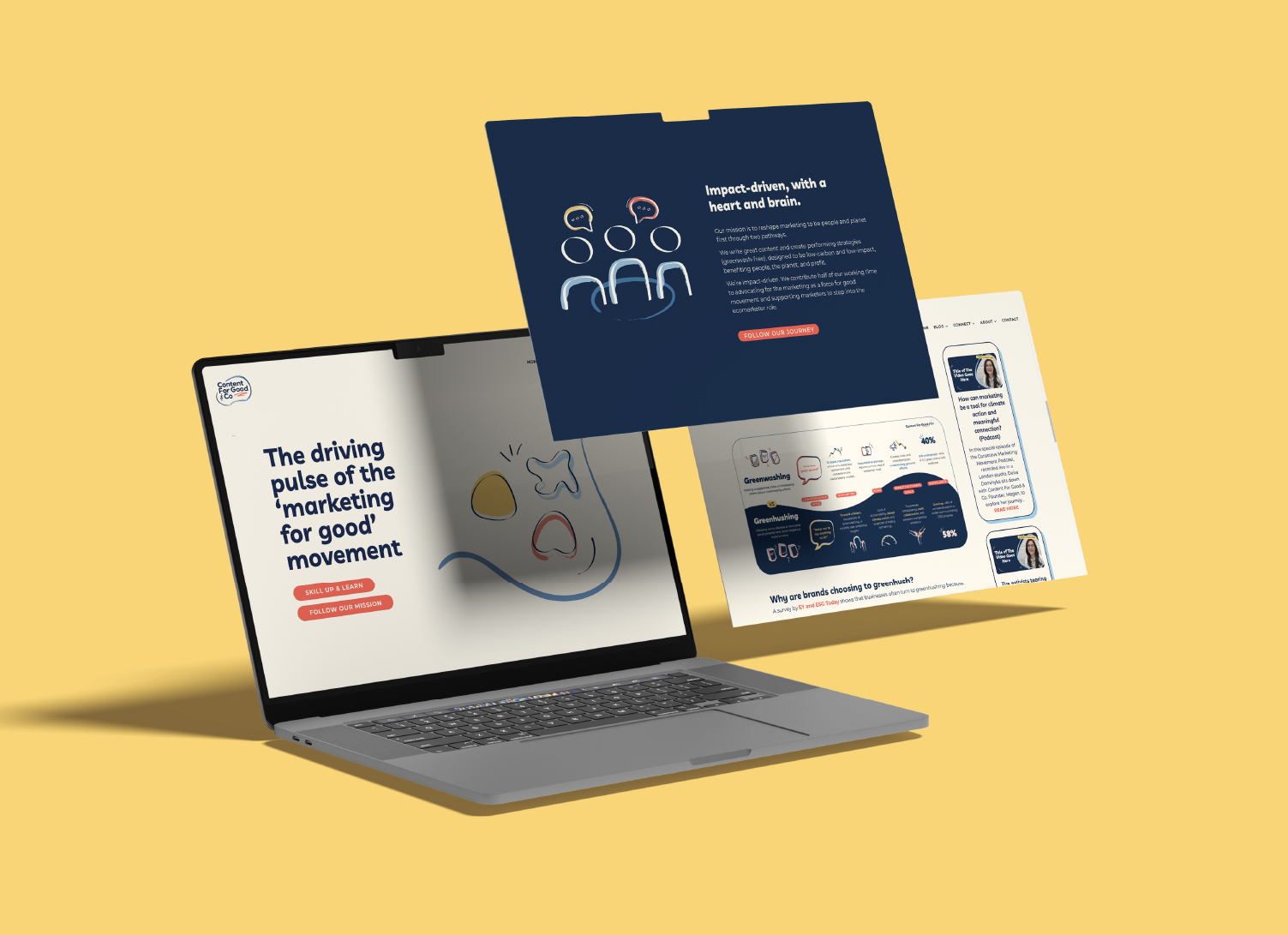
Content For Good & Co needed a vibrant new visual identity to mark their shift from a marketing agency to an NGO reshaping marketing for good. Design work included a full visual identity design, website illustrations, branded templates, and a growing suite of print and digital assets.

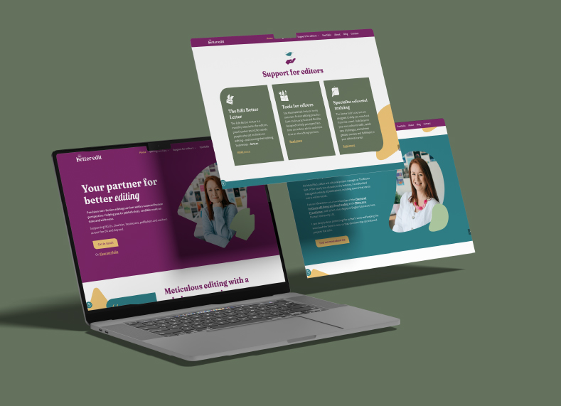
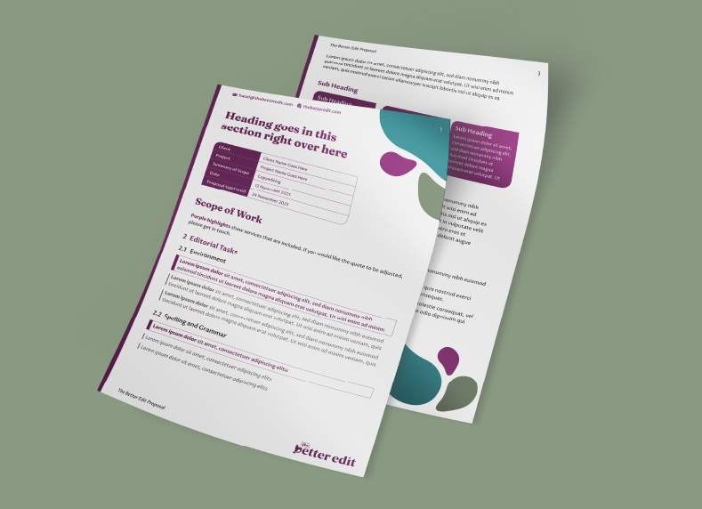
The Better Edit is a non-fiction editorial practice that needed a new visual identity because their brand was being held back by their previous visuals. The aim was to create a visual identity that retained meaningful connection to the original brand whilst building up its personality and coherence.
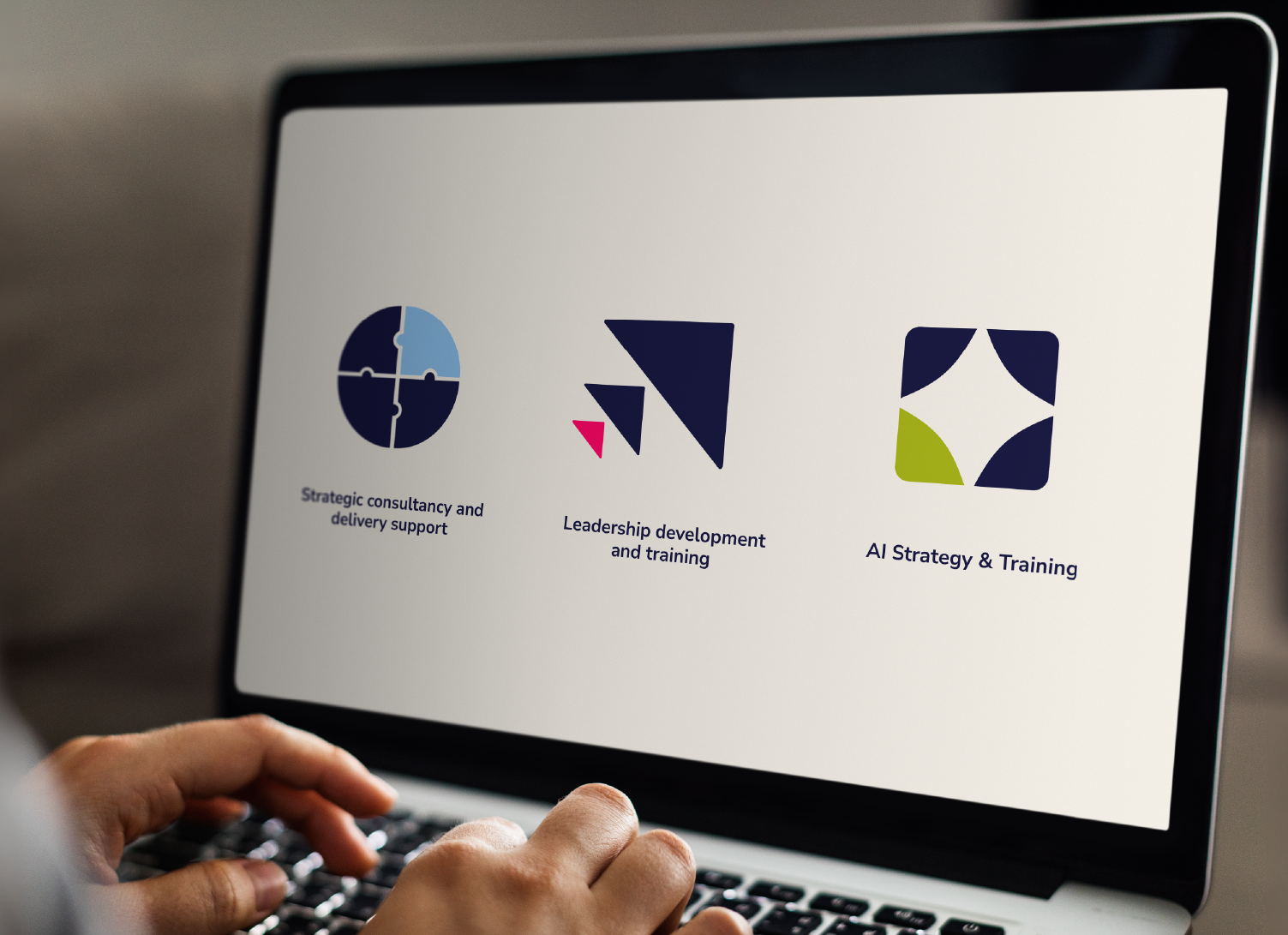
Education by Donovan is an education consultancy that needed a visual identity that had to speak to two different industries, two distinct audience groups, and communicate their three unique services. The resulting design positioned them as a disruptor and challenger brand in the education space.