The Resilience Project supports young people navigating eco-anxiety and climate burnout, helping them build the psychological tools to stay active, engaged, and hopeful in the face of the climate crisis.
Their existing visual identity was no longer suitable for their mission; it no longer reflected who they are, or the weight of what young people are facing.

The starting point for this project was understanding the brand's audiences. The Resilience Project needed to speak to three distinct groups: young people actively engaged with climate activism, young people who were more hesitant or disconnected from the movement, and the funders, institutional partners, and experienced mentors who needed to trust the organisation enough to invest in it. Their existing audience also skewed more heavily female; which was something else that had to be addressed in the redesign to move them towards more gender parity.
Brand discovery sessions with the team and consultations with the audiences helped form the strategic foundation for the rebrand. I researched peer organisations, as well as the countries and cultures The Resilience Project operates in.
This allowed me to put forward two distinct creative routes that could inspire the visual identity. The chosen direction was industry-disruptive and took a step away from euro-centric design norms — a deliberate decision given the global reach of The Resilience Project's work and the diversity of the communities it serves.
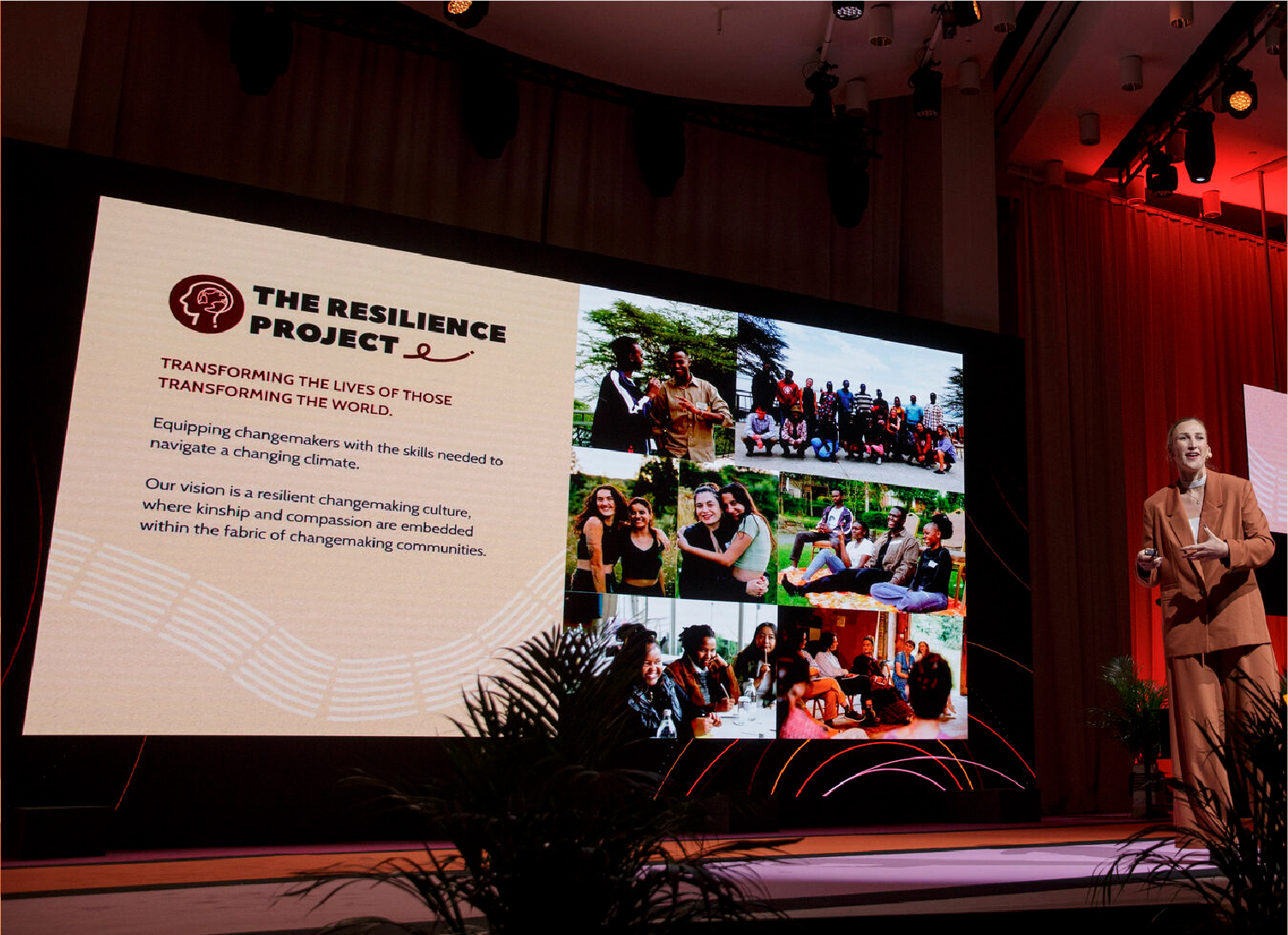
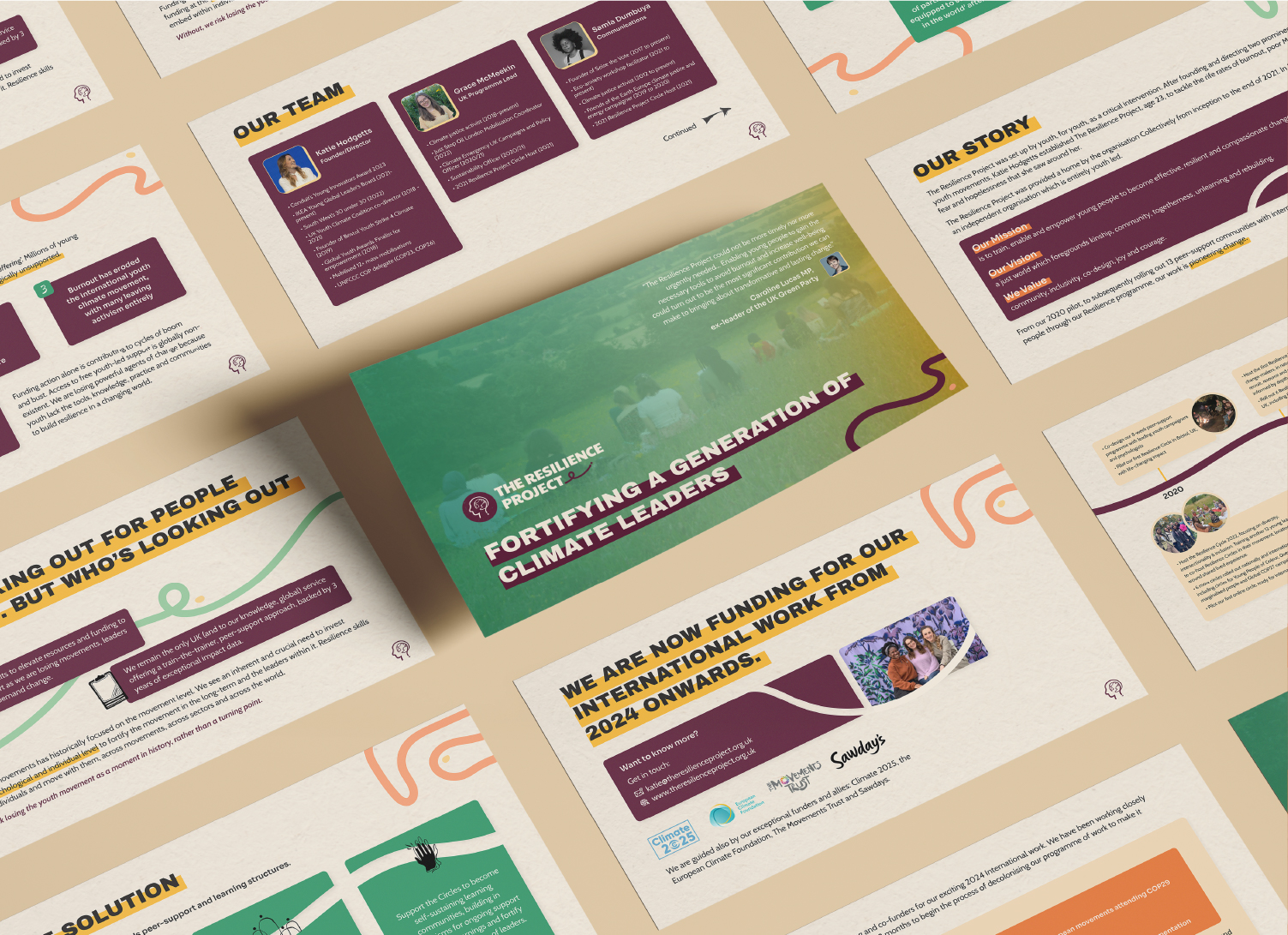
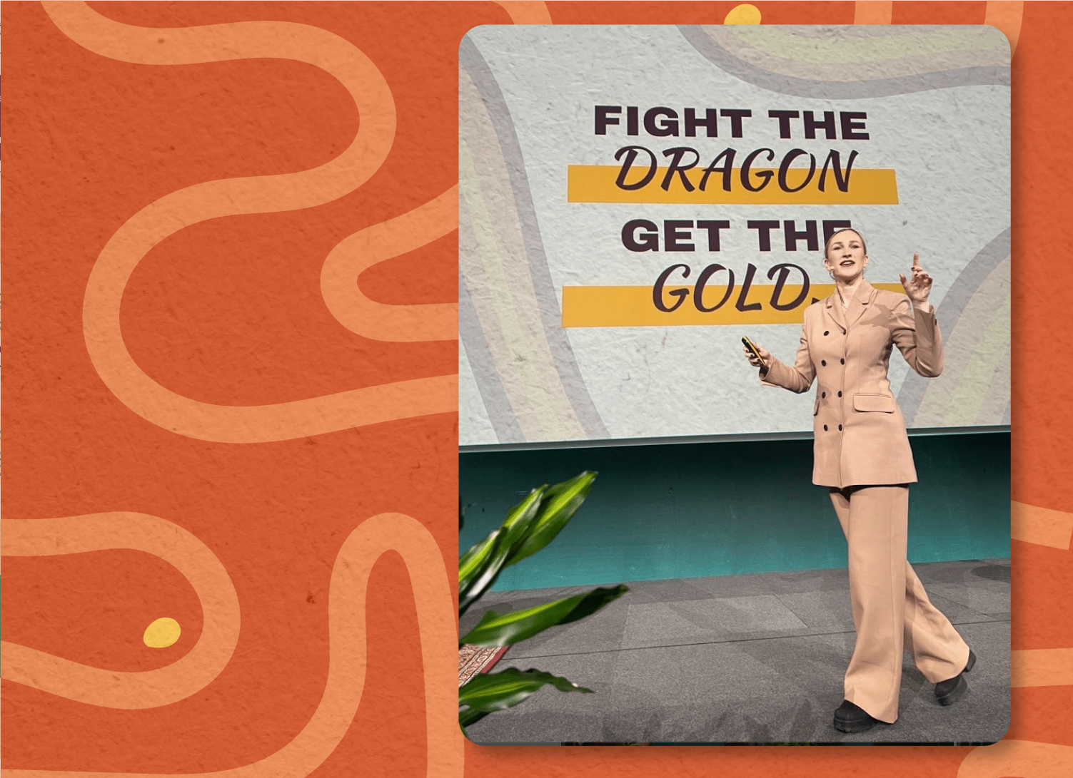
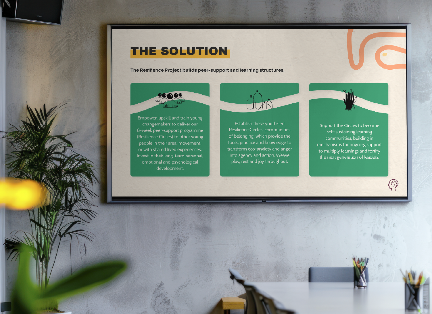
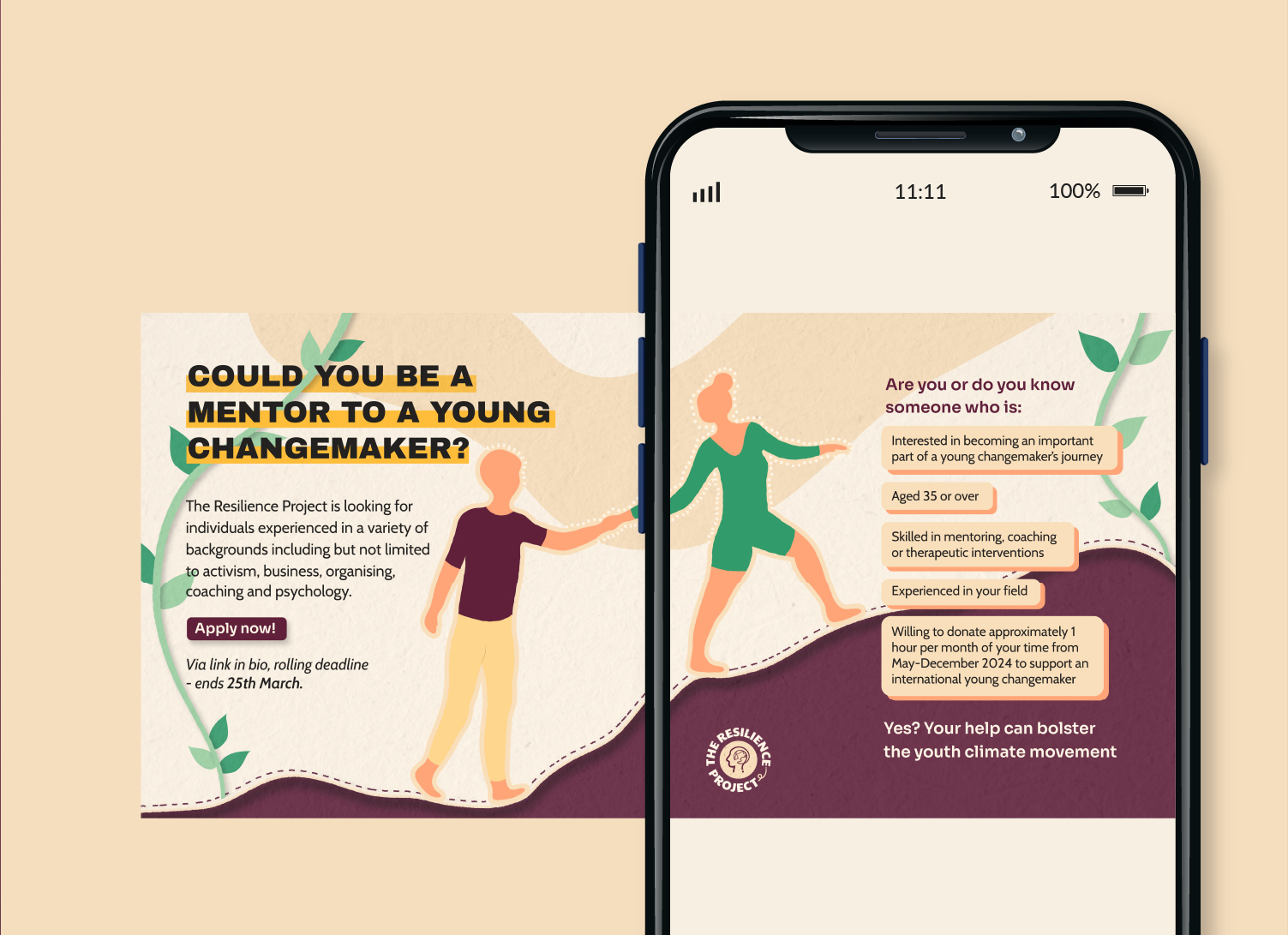
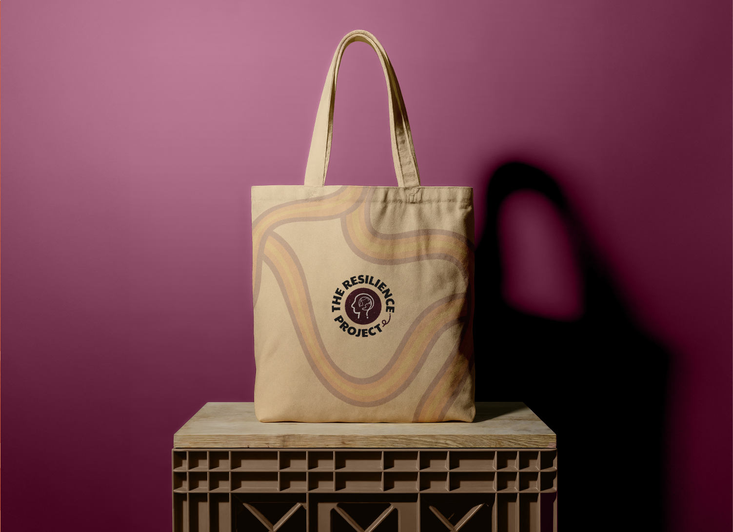
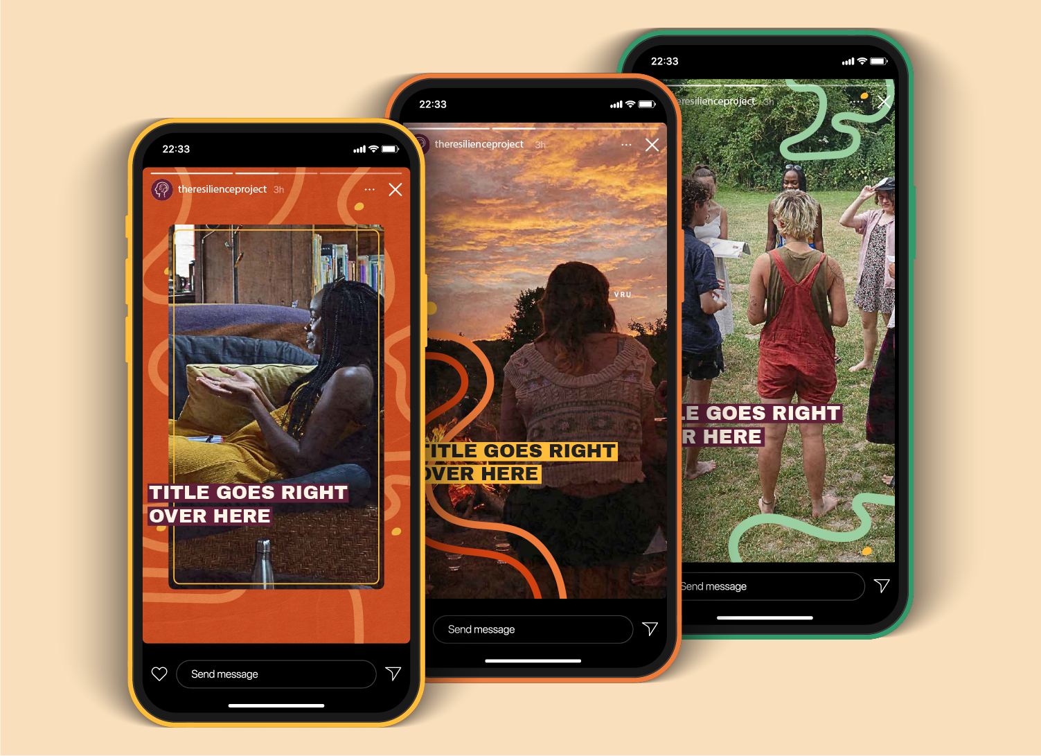
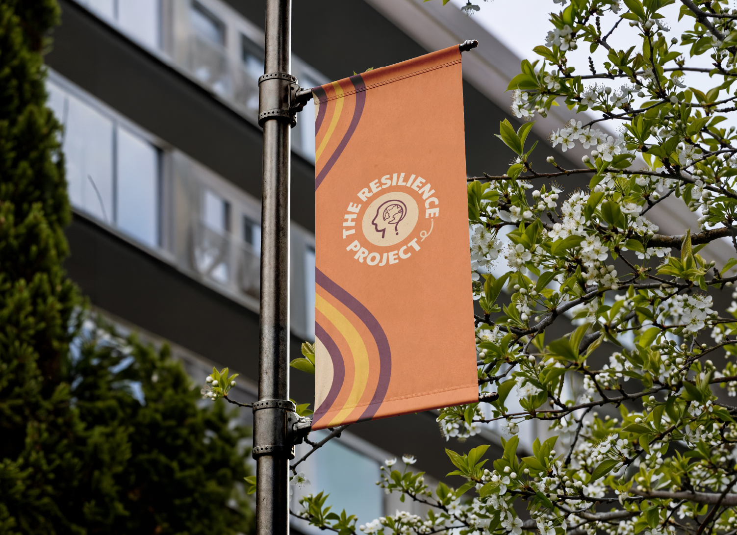
The result was a bold, energetic visual identity that signals conviction without intimidation. It was extended across social media templates, a pitch deck, and ongoing campaign assets.


"She fully understood our brief and was able to elevate it with her own artistic flair. Tara is an excellent communicator and fully understood our needs - I highly recommend working with her"
The Resilience Project now carries a visual identity that reflects the full complexity of their mission. It is bold enough to resonate with young people on the front lines of climate activism, inclusive enough to reach those who haven't yet found their footing, and credible enough to stand in front of funders and institutional partners.
Since the rebrand, they have expanded globally, secured vital new funding, and presented at the IDG Summit; taking their work, and their new brand, onto an international stage.