A deeply considered, research-led approach is how we create a visual identity that you don't just love, but one that does exactly what you need it to.
This is why before designing, we do foundational work together so I am clear on:
When creative decisions are made after establishing this foundation, the result is a visual identity that is strategically grounded, culturally considered, and built to be recognised, understood and remembered by those that matter.
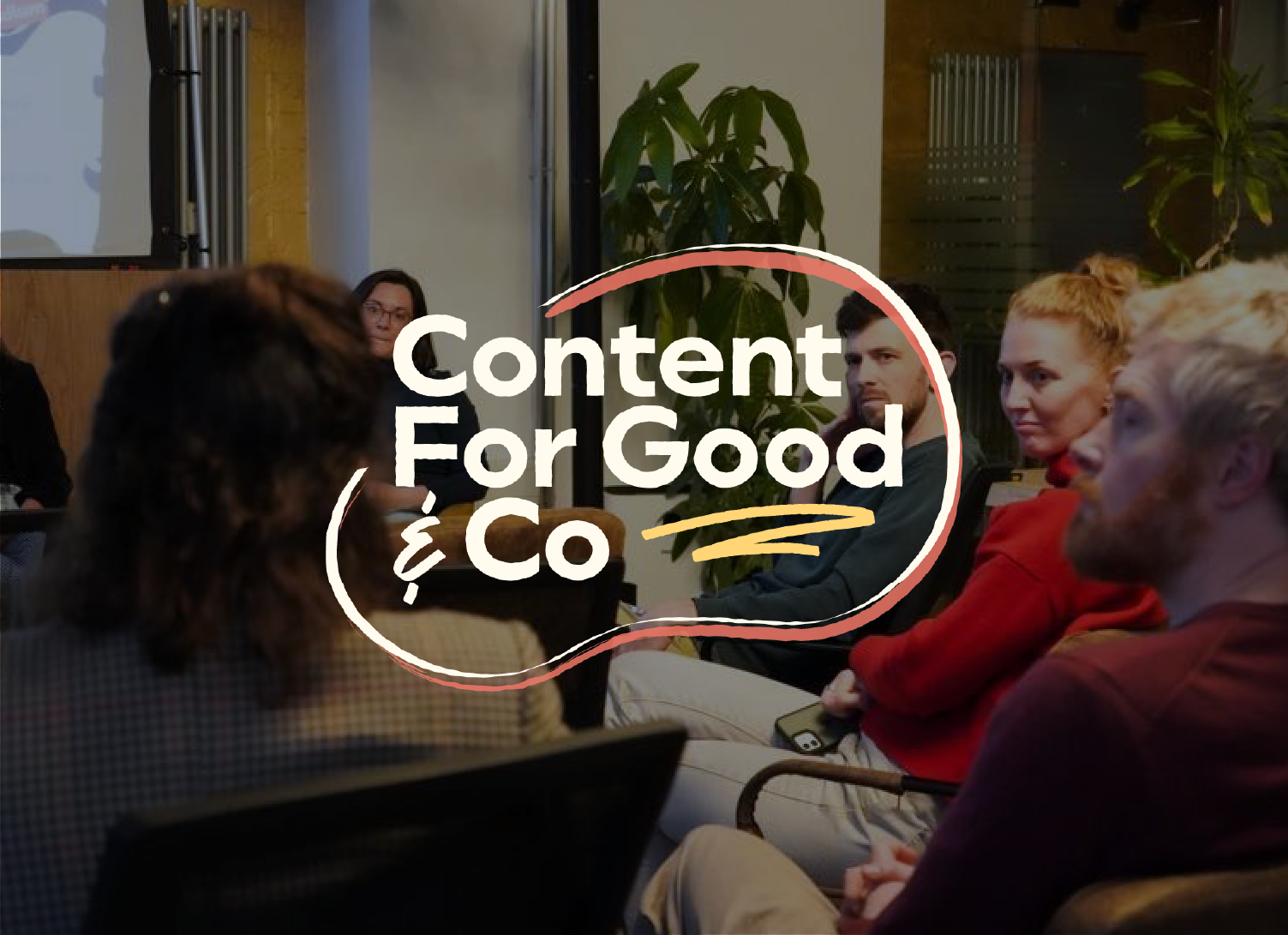
Content For Good & Co needed a vibrant new visual identity to mark their shift from a marketing agency to an NGO reshaping marketing for good. The result was a visual identity that disrupted the sustainable marketing industry, whilst holding the trust of their community that cares deeply about authenticity.

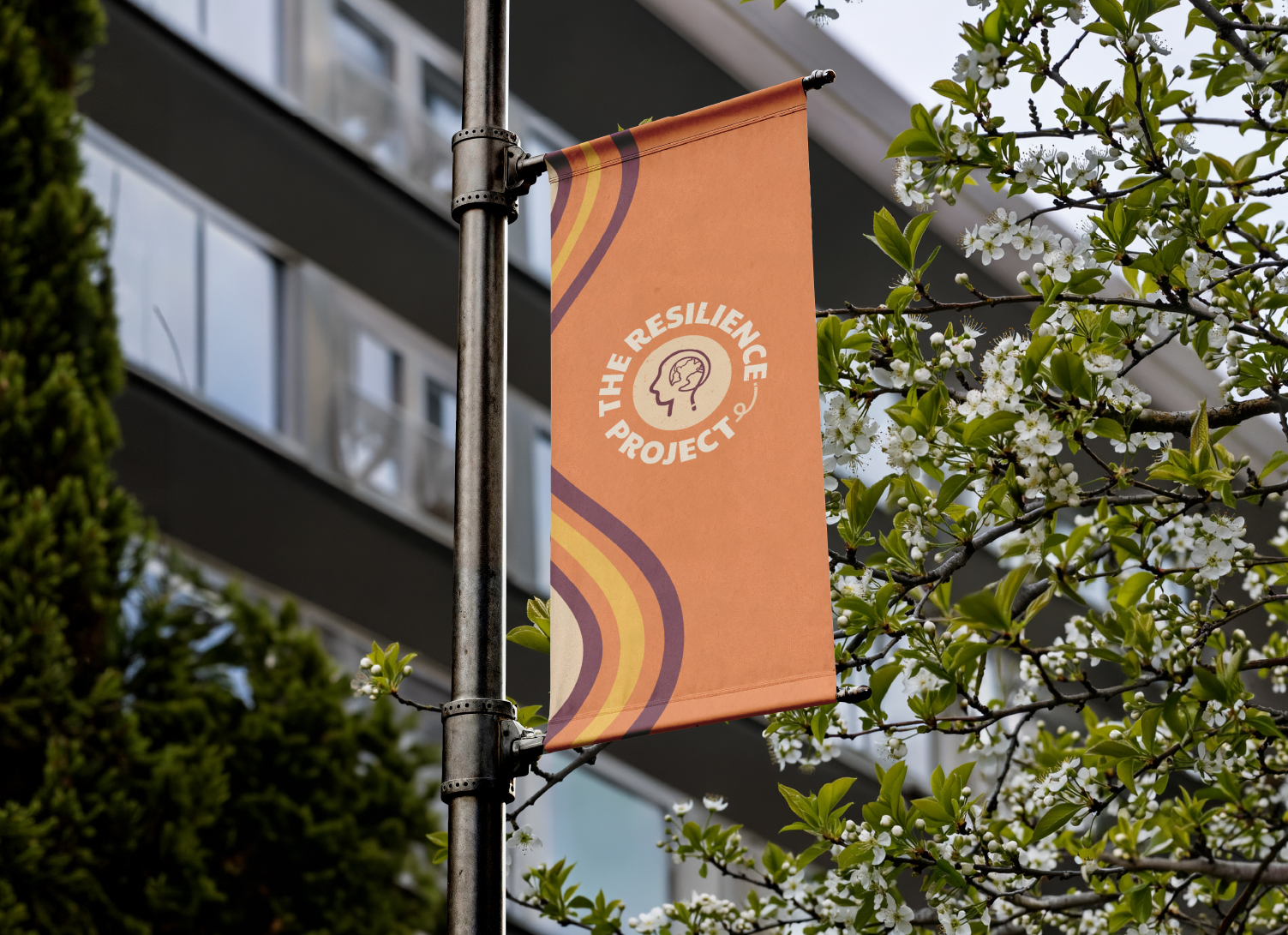
The Resilience Project is a global non-profit that needed a full visual identity redesign to resolve the disconnect between their mission and their visuals. Since the rebrand, The Resilience Project has expanded globally, secured vital new funding, and presented at the IDG Summit.

Education by Donovan is an education consultancy that needed a visual identity that had to hold two distinct industries, three services, and two audiences in one design. The resulting visual identity positioned Education by Donovan as a genuine challenger brand in both spaces.
Each visual identity project follows my same strategic process. This ensures we create a visual identity that not only looks good, but one that works for its intended purpose, creates clarity not confusion, and is culturally and contextually safe.

Across every project, a few things come up again and again in client feedback: