The Better Edit, led by Hazel Bird, offers non-fiction editing services with a nuanced human perspective. She supports NGOs, charities, businesses, publishers and authors across the UK and beyond. She also has a growing resource and education offering for fellow editors.
However, The Better Edit's visual identity was outdated and hadn't kept pace with the quality of the work or the breadth of what the business had become over the years; which was slowly costing it credibility.
In a discovery workshop we explored The Better Edit's two distinct audiences (clients hiring Hazel as an editor, and the fellow editors she educates and sells resources to) and their different trust signals. We also explored their brand values, messaging, and how their brand recognition that was built over the last 15 years would be maintained.
I then did a visual competitor analysis to better understand the industry landscape and see how The Better Edit could stand out and position itself as a leader in the industry. I used these insights to propose a strategy for the redesign, whilst putting forward two distinct mood boards to convey the visual stylistic routes we could take.
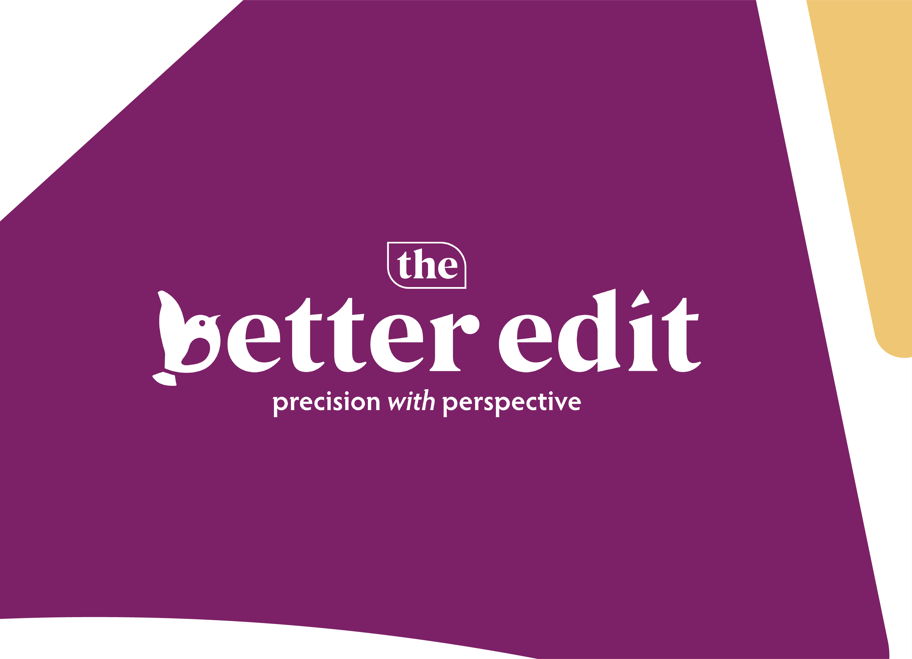
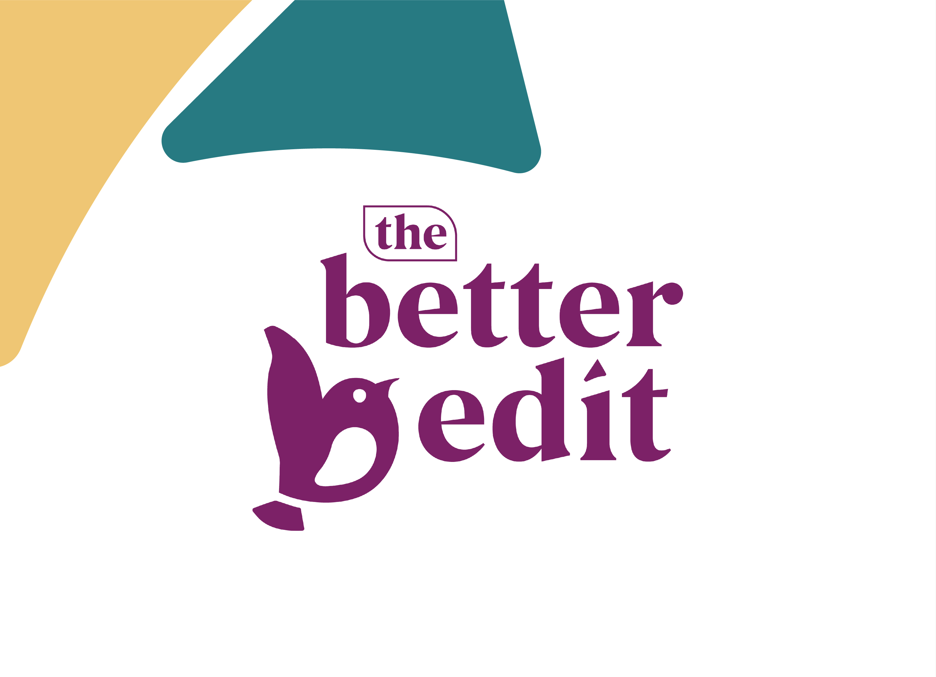
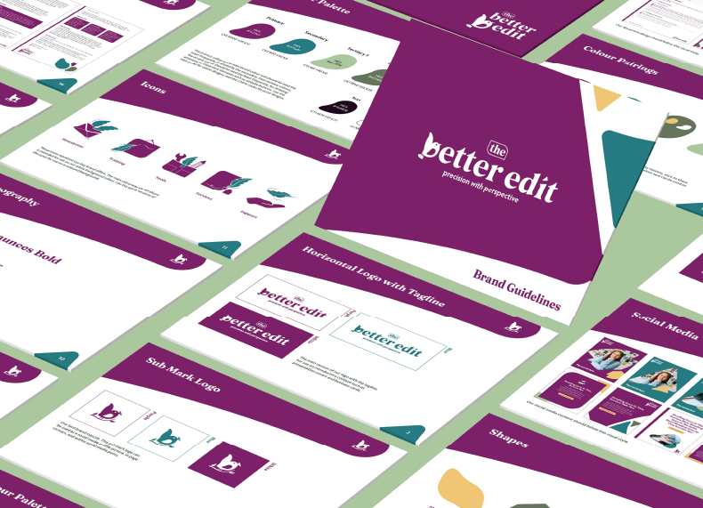
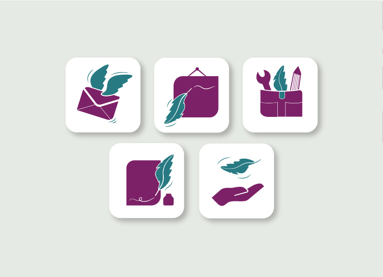
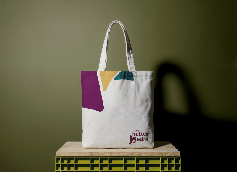
The visual identity was then designed using the chosen mood board as a reference. The result was a bold, geometric design with strong personality. The teal and purple colours that had built brand recognition over the years were retained and refined. A bird motif that was also present in their previous visuals was completely redesigned with a more geometric approach; it also doubled up as the 'b' in the wordmark. The visual identity covered several logo versions, bespoke icons, unique shapes, and a complete set of brand guidelines.
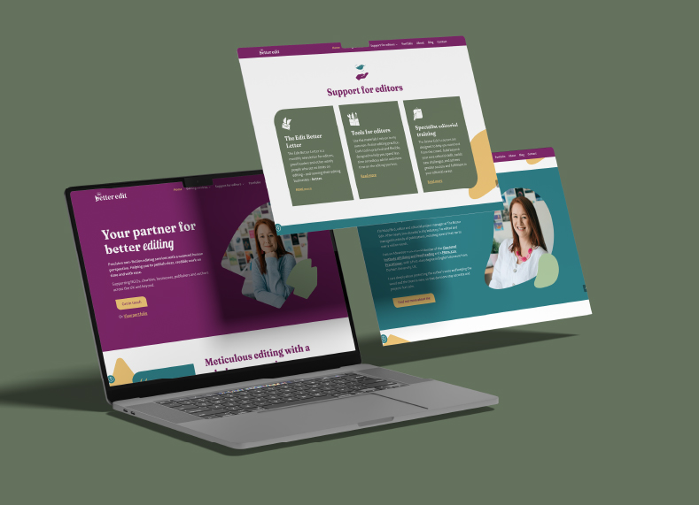
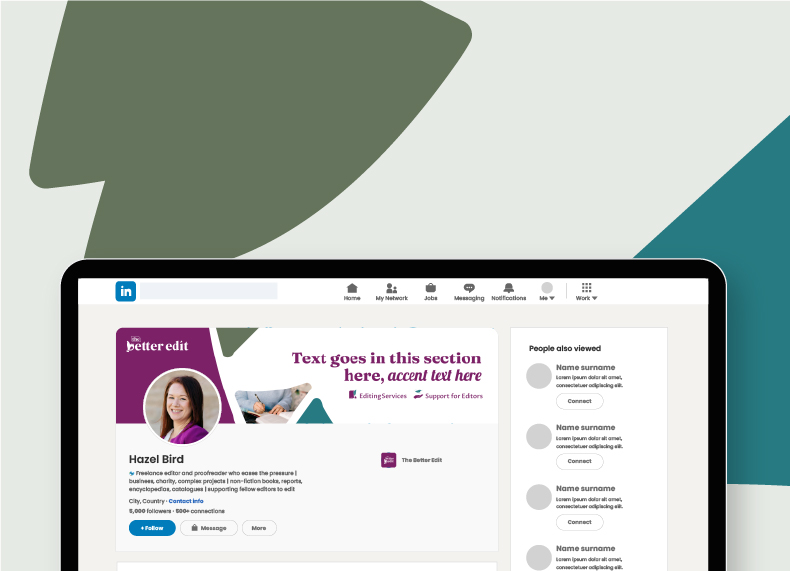
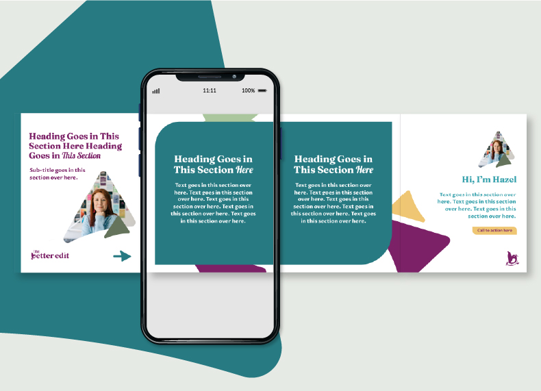
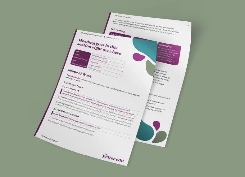
The design was then extended across social media templates, a proposal template, and comprehensive website designed by the team at Pie Heart Studio.
“Tara listened carefully to what I wanted; I’m honoured she lent me a bit of her genius. She was great at listening to what I wanted and adapting as we went along. She also did a brilliant job of keeping elements of my previous branding so there would be continuity, but giving me a whole new identity at the same time."
The new visual identity closed the gap between the quality of The Better Edit's service and the quality of their visuals. They now have a visual presence that is distinct, memorable, and credible in front of major organisations; whilst also positioning Hazel as a thought-leader with equal credibility in front of the editor community she's building.
The impact was measurable; enquiries for editorial services increased month on month following the rebrand, tracking higher than the same period the previous year and above her monthly average throughout.